Is Max Pain Theory Really a Thing?

A data science personal project.
Disclaimer: This post is made solely for informational purposes. I am not a financial professional and this post does not contain financial advice. Although the content of this post relates to data which is financial in nature, any expression of opinion about this data is personal to me as the author and I make no guarantee of any sort regarding accuracy or completeness of any information or analysis supplied. Nothing in this post should be construed as a recommendation regarding any investment action or strategy. Investing is risky. Do your own research. Consult a financial professional.
Summary
I reduced approximately 135M rows of historical Option Chain data, for the period covering a six month period from June - December 2023, to a data set of approximately 1.3M rows appropriate to examining whether the statement 'underlying stocks will move in the direction which will result in the largest value of stock options expiring worthlessly' is true.
Findings
Max Pain Theory states 'underlying stocks will move in the direction which will result in the largest value of stock options expiring worthlessly'. I discovered this is sort of true, if you aggregate all the stocks together, but the aggregate movement is very minimal as the distance between the Max Pain Strike and the Price of the Underlying, in aggregate, is consistently very small...
Similarly, in aggregate, the Max Pain Strike seems to quite accurately predict the eventual Price of the Underlying on the date of the Option Contract Expiry up to 45 days in advance, which is a notable finding, but the accuracy of the prediction does not seem to significantly change or improve during this period.
Given the immense diversity in the performance of the Underlying Stocks in the data set, these performance observations in the aggregate cannot be directly extrapolated to the performance of any individual Symbol in the data set.
As a result, for this way of looking at the question, Max Pain Theory appears to be only minimally true overall, and very possibly not true for any specific Symbol.
Actionable Conclusions
The biggest actionable conclusion to be drawn here is that the data set constructed to address the simple questions asked contains many features warranting further inquiry. Some of these opportunities include:
- classifying the symbols by their performance characteristics and attempting to identify individual Symbols where the Max Pain Strike is conclusively predictive of the eventual price of the Underlying Stock;
- identifying Symbols where movement in Price recurs in a predictable time period, as seen in some graphs for the aggregate and for some individual symbols below;
- identifying the causes of the consistent changes in value in specific time periods seen in the heat charts below,
...and more. As I make efforts in these directions I may update my progress in future posts.
Disclaimer: This post is made solely for informational purposes. I am not a financial professional and this post does not contain financial advice. Although the content of this post relates to data which is financial in nature, any expression of opinion about this data is personal to me as the author and I make no guarantee of any sort regarding accuracy or completeness of any information or analysis supplied. Nothing in this post should be construed as a recommendation regarding any investment action or strategy. Investing is risky. Do your own research. Consult a financial professional.
About Me
I'm a full lifecycle innovation leader with experience in SaaS, ML, Cloud, and more, in both B2B and B2B2C contexts. As you are implementing your value proposition, I can take a data driven approach to helping you get it right the first time. If that seems helpful to you, please reach out. I'm #OpenToWork.
Detail
Why Am I Doing This?
I was laid off a few months ago. One of the more dangerous things you can do when that happens is take an interest in the stock market. It can seem obvious to try to day trade your way to financial independence, but giving in to that urge usually makes an already bad situation far, far worse.
A skeptical person exploring the possibility anyway might come across a belief in the market called 'Max Pain Theory'. This relates to trading in stock options. Max Pain Theory asserts that underlying stocks will move in the direction which will result in the largest value of stock options expiring worthlessly. There is little or no proof offered to support this assertion - it is generally taken on faith, although that faith may be faint indeed.
As a recently laid-off person who likes working with data, digging into this seemed like a perfect personal project to work on: Big Data, Data Science, and Data Visualization are a trifecta of employability in this modern world. If I could learn more about each of these on a project which would showcase my capability in each, that seemed like a good use of time.
So with curiosity and a bit of madness I set out to figure out if there was any way to quantify if Max Pain Theory is a thing or not. This essay is a report of what I did and what I found. I will warn you it is a long read; I will do my best to make it rewarding for you the reader.
Framing the Question
Any good data science project starts with the task of framing the question. Imperative to good framing is the idea that some frames can be answered with the available data more easily and completely than others. A poorly framed question can lead to great effort only resulting in unsatisfying answers.
So what is the question?
Max Pain Theory asserts that underlying stocks will move in the direction which will result in the largest value of stock options expiring worthlessly.
There are two data values in this statement: the price of the underlying stock, and the Max Pain Strike price. Implicit in the Max Pain Strike is the fact there is a date when the Options Contract will expire. It is also important to recognize that the Max Pain strike value is not fixed: the Max Pain value can change literally on a minute by minute basis, as can the price of the underlying.
Restating the above slightly, taking these considerations into account: "In the period leading up to the Options Contract Expiry Date, does the difference between the Underlying Stock Price and the Max Pain Strike diminish?" seems like a more accurate and measurable question.
If the utility of Max Pain Theory is its use as a predictor of future stock prices, the quantification of its accuracy as a predictor of future stock price seems to be aligned with the spirit of the inquiry. What is being predicted? The Price of the Underlying Stock on the date of the Options Contract Expiry. In fact the Underlying Stock Price actually is moving inevitably toward this final price: the notion that the Max Pain Strike value predicts this price is necessary to the notion that the stock price moves toward the Max Pain Strike value. Reframing the question again, taking into account this insight, might result in the following: "What is the accuracy of the Max Pain Strike as a predictor of the terminal Underlying Stock price for the Options contract, and does that accuracy improve during the period leading up to the Options Contract Expiry Date?"
These two questions measure different, albeit related things. The first tests the relationship between the current Stock Price and the current Max Pain Strike. The second question tests how accurately the Max Pain Strike predicts the terminal value of the Underlying at a future arbitrary Options Contract Expiry date.
Both of these questions seem answerable, if one is willing to do the work required.
Measurement Model
Understanding the questions to be answered unlocks the next question, which is: what are the measurements that need to be implemented, and at which measurement points, to collect the data needed to generate the actual answers?
This is a high level model of the measurements we would make to answer the first question:
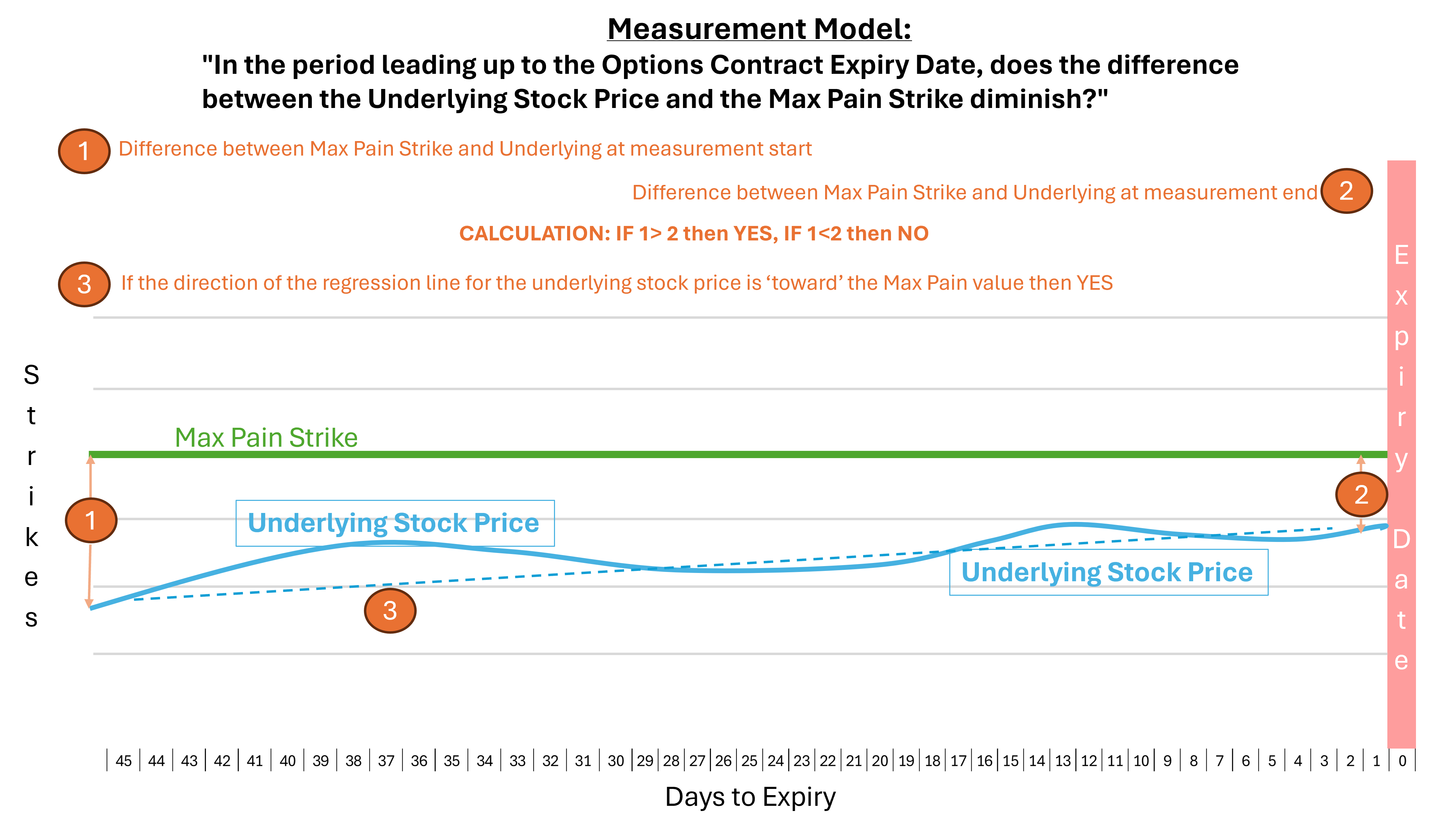
This simple model reflects the nominal simplicity of the Max Pain Theory: In this model, as time progresses toward the Expiry Date, the Price of the Underlying Stock approaches the value of the Max Pain Strike. If you measure the difference between the price of the Underlying and the Max Pain Strike value many days before Expiry, and again on Expiry, simple math will tell you if the two values converged, or did not converge.
Seems pretty simple, but having only start and end point measurements might hide a lot of volatility occurring between those two points. In this simple model it all looks pretty simple, where in reality it is probably not.
The second question is important precisely because the answer to the first question can lack a lot of nuance. Here we are trying to be much more precise:
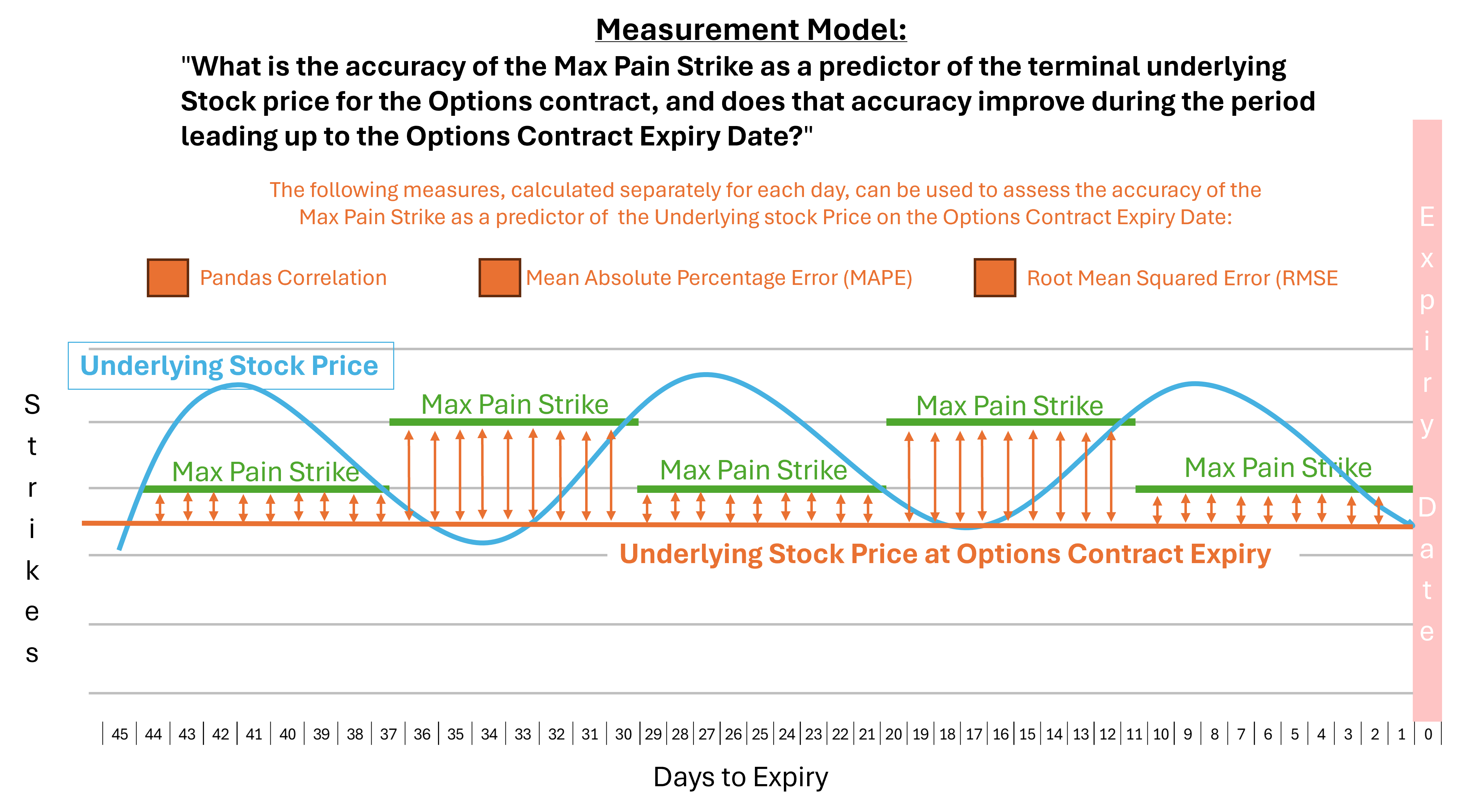
In this case we are taking the value of the underlying at close of the date of Expiry, and looking back to see for each day leading up to expiry if there is a strong or weak correlation between the Max Pain Strike and the ultimate value of the Underlying. Additionally, we can treat the Max Pain Strike value as a prediction, and then apply to it measures that are typically used to measure the accuracy of predictions in contexts like machine learning. Mean Absolute Percentage Error (MAPE) and Root Mean Squares Error (RMSE) are well known but differently performing tools often used to assess this accuracy. For machine learning in particular it is typical to compare multiple measures across multiple model versions to characterize performance. We will utilize that approach here.
Data Sources and Tooling
For this project it is necessary to have a source of historical options data. This is not as easy as it sounds. While one can easily use open source tools to query Yahoo! for free historical stock price data, there is seemingly no source for free historical options chain data - indeed, there is a general absence of data which allows one to place current options chain values in an historical context. Want to easily know what the price was for that $250 Call yesterday? Good luck with that.

After much Googling I found https://www.discountoptiondata.com/, who provide historical data for US options for the last approximately 20 years. This is daily data, providing values for the close of each trading day. If you are a high frequency trader, this is not for you, but if your goal is to simply monitor the overall movement and value of an option over its lifespan, this data is suited to the task.
The data provided comes in monthly .zip files. Each day of data consists of approximately 750k records: for a 30 day month approximately 22.5 million records must be processed.
To ingest and process the data in bulk I wrote Python code and ran it in AWS ECS Fargate containers. This allowed me to process the data for six months, or approximately 135 million rows of raw data, in parallel, in a relatively economical way. Processed data as well as copies of the raw data were stored in AWS S3 in Parquet format. During writing the AWS Glue catalog was also updated, enabling subsequent querying with AWS Athena.
Data augmentation, specifically OHLC data for each symbol for each Expiry date, came from Yahoo Finance and was accessed using the YFinance package
Subsequent data exploration was performed writing Python in a Jupyter Notebook. We also explored using Pyspark in an AWS Glue ETL Notebook script, but as with the initial extraction this seemed expensive for the need, and the size of the data, while large, never exceeded our ability to load the data we needed into local memory.
Data visualization was performed using Matplotlib and Seaborn, again in Python environments.
Transformations
An example of the raw data provided by DiscountOptionData can be downloaded here. The raw data (not including the greeks, which are not needed for this exercise) include the following data:
Symbol, ExpirationDate, AskPrice, AskSize, BidPrice, BidSize, LastPrice, PutCall, StrikePrice, Volume, OpenInterest, UnderlyingPrice, DataDate
It sort of looks like this:
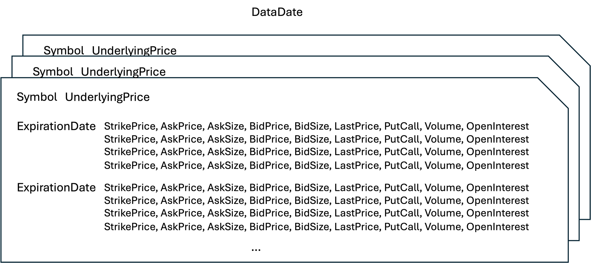
To this data we apply several transformations:
- For every row of data we add a field containing the number of days left to the Expiration date. This is a simple date calculation.
- For every row of data, specific to each Date, each Symbol, and each Expiration Date, we add the Closing price for the symbol on the date of expiration. To do this we will use the YFinance package to access YFinance historical data.
- For each Date, for each Symbol, for each Expiration Date, we calculate the Max Pain Strike and store the data associated with that strike on that date in a separate working table
- we then add to the working table the difference between the Max Pain Strike and the Underlying price, necessary to answering Q1.
- From the aggregated columnar data held in the complete working data set we use scikit-learn functions to calculate MAPE and RMSE as part of results generation for Q2.
- Data is normalized to show the time period for 45 days prior to expiry. Rows where the YFinance data is not available for the symbol are excluded, as are rows containing data for Saturdays and Sundays, which are not normal trading days.
Results for the first question: "In the period leading up to the Options Contract Expiry Date, does the difference between the Underlying Stock Price and the Max Pain Strike diminish?"
Repeating the Disclaimer: This post is made solely for informational purposes. I am not a financial professional and this post does not contain financial advice. Although the content of this post relates to data which is financial in nature, any expression of opinion about this data is personal to me as the author and I make no guarantee of any sort regarding accuracy or completeness of any information or analysis supplied. Nothing in this post should be construed as a recommendation regarding any investment action or strategy. Investing is risky. Do your own research. Consult a financial professional.
The data used to answer this question, after the transformations described above, consisted of 1,301,239 rows of data containing 5,723 distinct ticker Symbols and 211 unique Options Contract Expiry Dates. The time period covered by this data set is the six month period from June - December 2023.
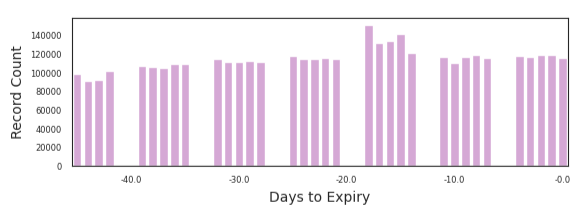
We grouped the data by Days to Expiry. For each distinct value for Days to Expiry we have ~80,000 to ~140,000 distinct records.
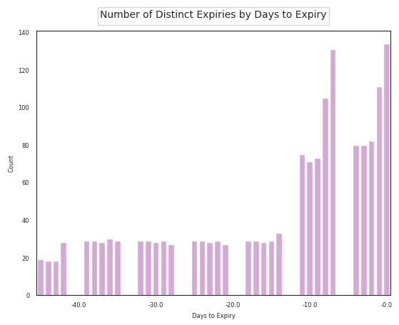
The records for each Days to Expiry grouping reflect results for between 20 and ~135 distinct Options Expiry Dates.
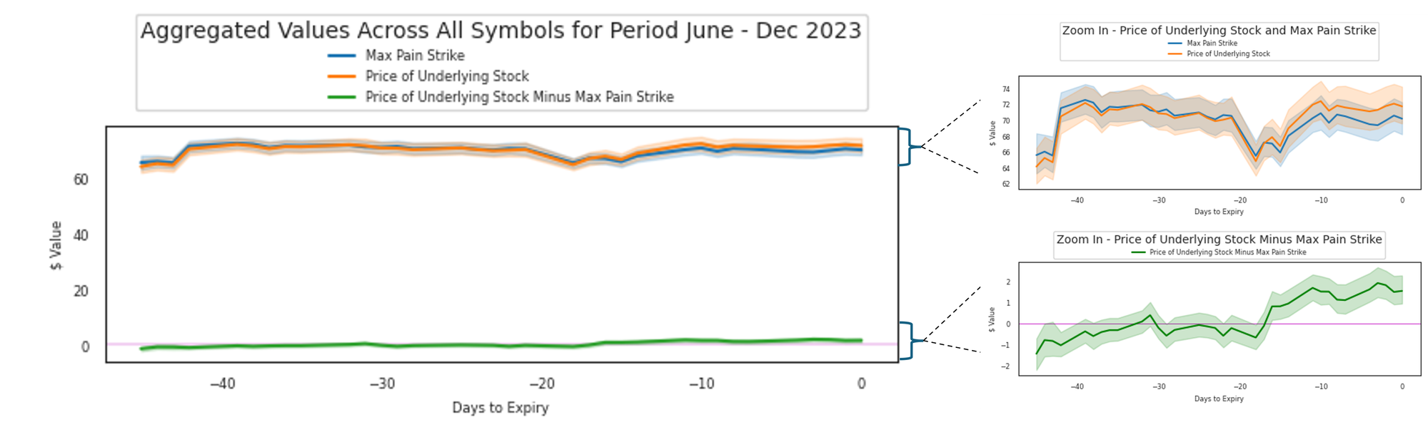
We aggregated the values for all symbols, and graphed the aggregate Max Pain Strike value against the aggregate value of the Underlying stock. We also graphed the difference between these by subtracting the Max Pain Strike value from the value of the Underlying in each case.
The first and most obvious observation we can make from these graphs is that there is, in aggregate, across all of the symbols and expiries included, a surprisingly small difference between the Price of the Underlying Stock and the Max Pain Strike at any given point in time.
Zooming in, we can observe the following:
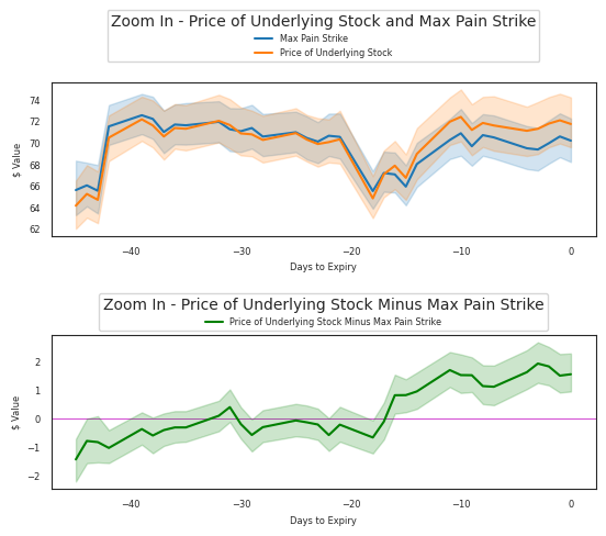
The green line on the lower graph 'Zoom In - Price of Underlying Stock Minus Max Pain Strike" shown above indicates that the average Price of the Underlying Stock at Day -44 is approximately $1.45 below the average Max Pain Strike, but rises to approximately ~$1.54 above the average Max Pain Strike by day zero, the Options Contract Expiry Date. This entire move is approximately ~4% of value on an average Underlying Price of about ~$70.
Generally and in aggregate, the mean Price of the Underlying was very close in value, but slightly below, the mean value of the Max Pain Strike at the beginning of the 45 day final countdown period, and rose to close slightly above the Max Pain Strike by the Expiry Date.
So the answer to the question "In the period leading up to the Options Contract Expiry Date, does the difference between the Underlying Stock Price and the Max Pain Strike diminish?" is YES, in aggregate and for the period of examination, the two values do converge as the difference between them zeros out by about day Expiry -20, but then the two values do begin to diverge again as the mean value of the underlying rises just slightly above the mean Max Pain Strike in the period immediately prior to expiry.
A striking and unexpected feature of the upper graph is the significant change whereby the mean values of both the Underlying and the Max Pain Strike rise by ~10% between Day -43 and Day -39. This rise in value reverses between Days -21 and -18. The values once again rise in near unison between Day -15 and Day-11.
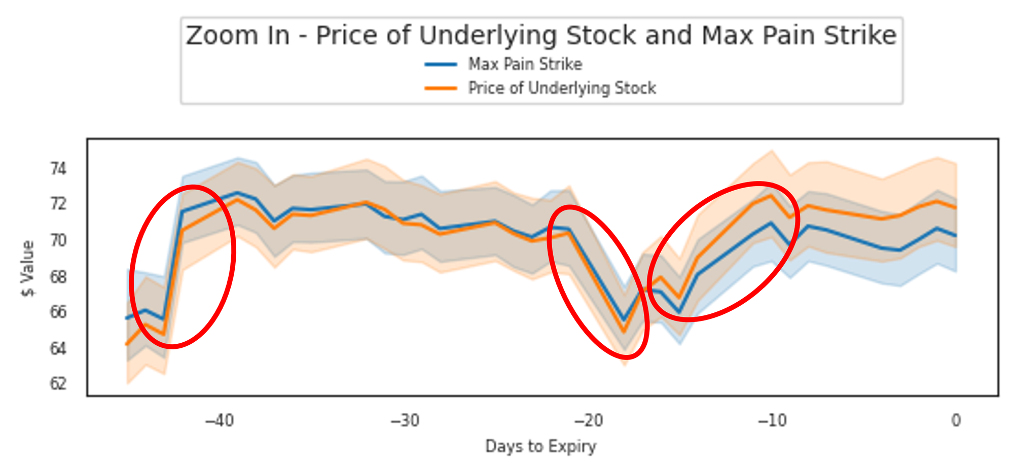
These large and clear moves in narrowly-banded aggregate value across a significant number of Symbols and Expiry Dates are unexpected. They may indicate a data quality issue, or there may be some cyclical cause we do not yet fully understand. For now we note the observation, pending further investigation.
Extrapolating these observations to the performance of any individual Symbol seems extremely challenging. The observations represent the aggregate performance of 5,723 distinct ticker Symbols over a specific period of time. To illustrate the difficulty of extrapolation we show here similar graphs for the same time period for a subset of the total population of Symbols, in this case Symbols starting with the first letter 'A':

As can be seen, there are a great many Symbols even in this small subset of the overall data set, and the graphs for this subset show a tremendous diversity of performance. A deeper dive in a later post will be needed to identify significant attributes of these performances.
While the data indicate that during the examination period the difference between the Underlying Stock Price and the Max Pain Strike does slightly converge at an aggregate level, it is very apparent this may not be true for any individual Symbol shown in the data set used to draw this conclusion. As a result, for this way of looking at the question, Max Pain Theory appears to be somewhat true overall, but very possibly not true for any specific Symbol.
Results for the Second Question: "What is the accuracy of the Max Pain Strike as a predictor of the terminal underlying Stock price for the Options contract, and does that accuracy improve during the period leading up to the Options Contract Expiry Date?"
Repeating the Disclaimer again: This post is made solely for informational purposes. I am not a financial professional and this post does not contain financial advice. Although the content of this post relates to data which is financial in nature, any expression of opinion about this data is personal to me as the author and I make no guarantee of any sort regarding accuracy or completeness of any information or analysis supplied. Nothing in this post should be construed as a recommendation regarding any investment action or strategy. Investing is risky. Do your own research. Consult a financial professional.
To answer this questi0n we look at three different metrics.
First, we are going to establish, for each day leading up to the Options Contract Expiry, if the Max Pain Strike is correlated with the Price of the Underlying on the day of the Contract Expiry. To calculate this we utilize the pandas.DataFrame.corr function.
Secondly we calculate the Mean Absolute Percentage Error for each day leading up to the Options Contract Expiry, to see what the magnitude of the error is on each day and to observe if the error reduces over time. To calculate this we use the scikit-learn sklearn.metrics.mean_absolute_percentage_error function.
Thirdly we calculate the Root Mean Square Error for each day, again to see magnitude of the error on each day and to observe if the error reduces over time. To calculate this we use the scikit-learn sklearn.metrics.mean_squared_error function, with squared=False to generate the root of the mean squared error in the calculation.
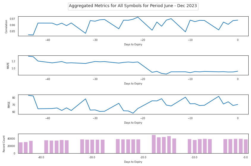
Using fields from the same root data set as above, we generate the data and graph it in aggregate for all symbols. Noting that MAPE has a well-documented performance issue where it generates extremely large values when the target value is extremely small, we limited the rows in the analysis to those with a Price of the Underlying on the day of the Contract Expiry of at least 1 cent:
A few simple and obvious observations on these graphs:
- All of the metrics appear to be banded narrowly without large or significant movements outside of these narrow bands.
- The data show a high level of positive correlation, throughout the entire run-up period to the Expiry Date, in the range of 0.94 to 0.98, between the Max Pain Strike and the Price of the Underlying on the date of the Options Contract Expiry. Since the Price of the Underlying on the date of the Options Contract Expiry is fixed in the data set, the jitter in this correlation is entirely due to changes in the value of the Max Pain Strike, which in aggregate appears to oscillate during the run-up period.
- RMSE appears to be somewhat in aggregate negatively correlated with the correlation value. RMSE also appears to oscillate during the study period, but appears to occupy the bottom portion of t he band during the early period, and the upper portion of the band during the final 2-3 weeks of the run-up. This implies that, far from converging, the Max Pain Strike diverges slightly from the Price of the Underlying on the date of the Options Contract Expiry as the Date of Contract Expiry approaches.
- MAPE shows a large and visible move from the top of the band to the bottom of the band about 20 days prior to the Options Contract Expiry, implying an aggregate reduction in error in this time period which then persists until expiry.
In short, the prediction seems very accurate at an aggregate level, with a MAPE of ~1%. We see a high level of correlation but only MAPE shows evidence of improvement in the accuracy of the Max Pain Strike as a prediction of the eventual Price of the Underlying on the date of the Options Contract Expiry, and this improvement is less than a single percentage point in magnitude, reinforcing the notion that the prediction was very accurate to begin with.
These are aggregated measures, so we are naturally curious to see if the prediction quality is similar at an individual symbol level, and if the measures for individual symbols show patterns of any kind.
The correlation and MAPE scores for individual symbols are normalized and allow for a direct symbol to symbol comparison, so we are able to elect to use heat maps for direct symbol by symbol comparison. In contrast, the RMSE values are specific to the symbol and do not lend themselves to easy comparison between symbols, so here we elect to use a separate line chart for each symbol.
As with above, there are numerous symbols in the data set so we limit this exercise to symbols beginning with the letter 'A', sorted alphabetically.
We begin by examining correlation between the Max Pain Strike and the Price of the Underlying on the day of the Contract Expiry. Correlation gives results in the range of -1 to 1, with 1 and -1 indicating a strong positive or negative correlation and a zero value indicating an absence of correlation.
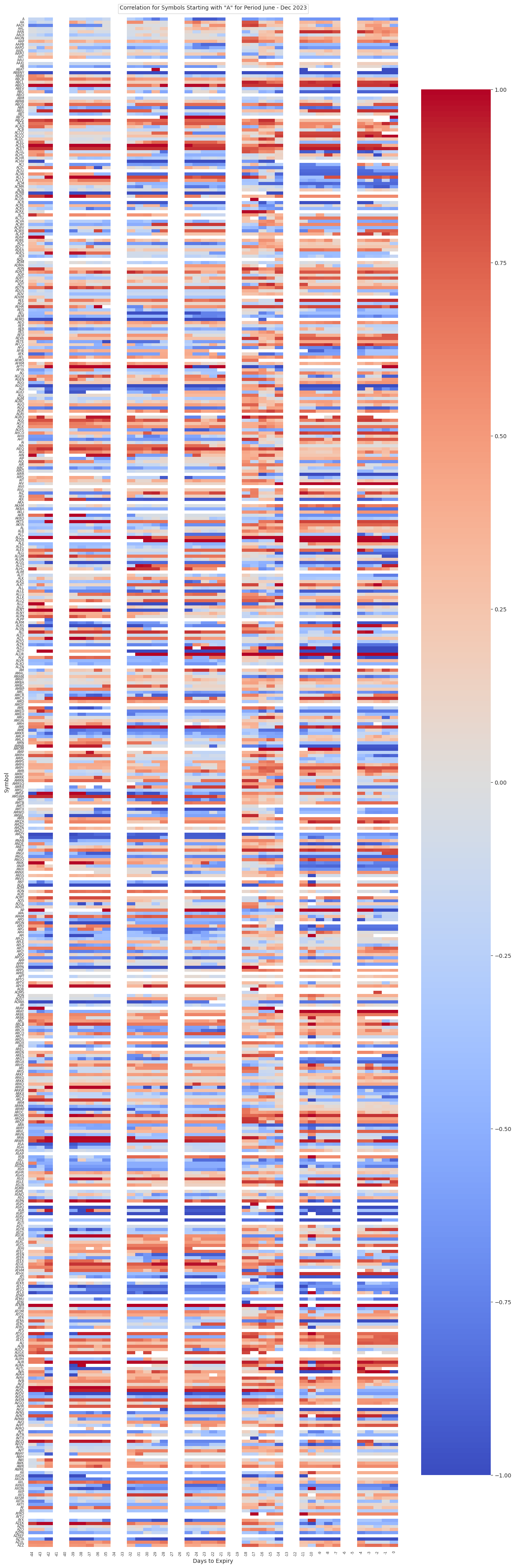
Looking at this view, we observe many of the symbols have high positive or negative correlation. Observable in this view is a consistent vertical area on days -16 and -15 where there are visibly consistent changes in correlation value. There is a similar but less consistent change in correlation value change visible on day -10. In spite of these clear areas of change in value there is not visible a strong left-to-right trend visible: neither side is visibly more positively or negatively correlated than the other and there does not seem to be a visible and consistent horizontal movement from one correlation value to another, although this may indeed happen on an individual stock basis.
Turning to MAPE, again we are confronted with the fact that small target values can result in very large MAPE values. A box plot of the MAPE values generated shows numerous large outliers in the data set:
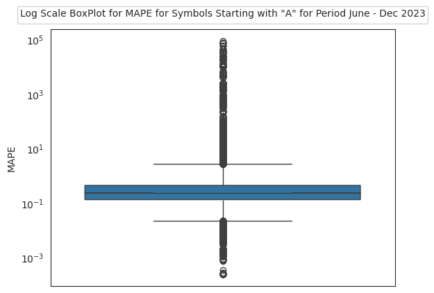
Using pandas describe() function we can see the following detail about the data itself:

What does this tell us: that the outliers, and even the data in the first standard deviation, have much higher values than the data in the 75th percentile. A heatmap using all of this data will leave the majority of individual values, which have much lower values, essentially undifferentiated in color. The solution is to filter the data to show only the rows with values which are 'between the whiskers' in the box plot. Filtering so we only retain these rows, the heatmap for MAPE appears as:
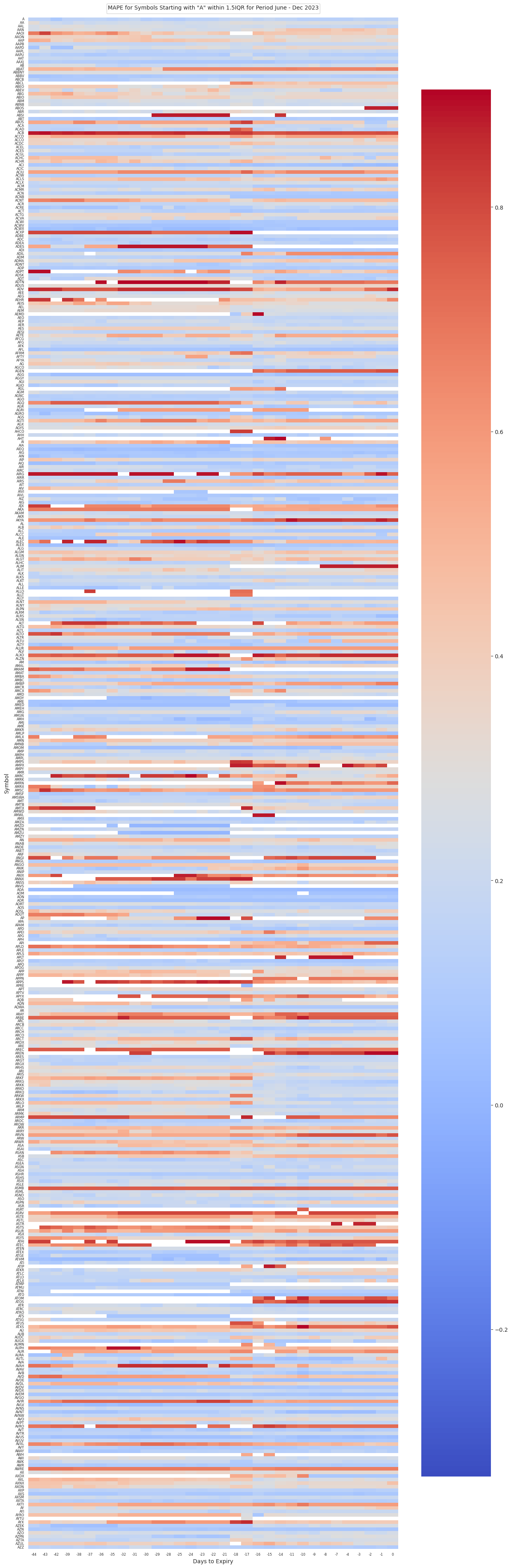
Again we see that, while the data are horizontally not strongly differentiated, there is a consistent vertical zone where values vary at day -18. A lesser vertical area can also be be identified around day -10, where values appear to more consistently change. This is adjacent to the similar effect visible in the correlation data, showing that there is value changing behavior occurring seemingly consistently across symbols during this middle period week of the Options Contract lifecycle.
Finally we examine Root Mean Square Error, or RMSE. RMSE is often used as a metric to measure the comparative predictive power of different machine learning models. Here, we use the Max Pain Strike as a proxy for the model prediction and the Price of the Underlying on the date of the Options Contract Expiry as a proxy for the training set target value. The RMSE value is not normalized between Symbols and is specific to the data for each Symbol: what we are looking for is evidence of a downward tilt in the line graph from left to right for each RMSE set of values, indicating an improvement in the prediction value as the date of the Options Contract Expiry approaches.
Because we can, we include the Correlation and MAPE values in this set of graphs as it is a way to visualize if there are any evident correlations between the values....

Again in this view we see evidence of a strong diversity of patterns and relationships between the measures, making blanket statements difficult to imagine. It does appear that classification into groupings may be possible: this is work for another activity. In answer to the specific question, whether the Max Pain Strike is a predictor of the future price of the Underlying, on an individual Symbol basis, the answer again appears to be that it depends upon the symbol and its individual performance, which cannot in this view be generalized.
Conclusion
I conducted a personal data science project to seek to validate whether a widely-known rule of thumb is valid or not. In doing so I used newly-developed and existing technical skills to generate a data set with many features warranting further analysis, which I now will pursue.
As you might have predicted, the data say that the rule of thumb, known as Max Pain Theory, isn't really a thing, but getting to that was never really the point.
Repeating the Disclaimer one last time: This post is made solely for informational purposes. I am not a financial professional and this post does not contain financial advice. Although the content of this post relates to data which is financial in nature, any expression of opinion about this data is personal to me as the author and I make no guarantee of any sort regarding accuracy or completeness of any information or analysis supplied. Nothing in this post should be construed as a recommendation regarding any investment action or strategy. Investing is risky. Do your own research. Consult a financial professional.
About Me
I'm a full lifecycle innovation leader with experience in SaaS, ML, Cloud, and more, in both B2B and B2B2C contexts. As you are implementing your value proposition, I can take a data driven approach to helping you get it right the first time. If that seems helpful to you, please reach out. I'm #OpenToWork.